
Nedap Now webhelp
-
Nedap Now webhelp
- Nedap Now - Getting Started
-
Nedap Now - Worklist
-
Nedap Now - Worklist Essentials
- Understand the Worklist Dashboard
- Manually Add an Animal to a Worklist
- When and Why Animals Appear on the Past Week Tab
- Add an Animal Back to the Active Tab
- Change the Sort Order in a Worklist
- Customize Columns in a Worklist
- Filter a Worklist
- Overview of Filter Operators
- Overview of Filters and Columns
- Print a Worklist
- View Animals at a Wrong Location
- View Life Numbers in Worklists
-
Nedap Now - Health Checks Worklist
- Understand the Health Checks Worklist
- Use the Health Graph to Analyze Animal Behaviour
- Understand the Health Score Graph
- When Do Animals Appear on the Health Checks Worklist?
- Handle Animals in the Health Checks Worklist
- Customize the Health Graph
- Control when Animals Appear in the Health Checks Worklist
- You Cannot Remove Animals with Urgent Health Checks
-
Nedap Now - In Heat Worklist
- Understand the In Heat Worklist
- Handle Animals on the In Heat Worklist
- Understand Reproductive Data Using the Reproduction Graph
- Use the Heat Score to Identify Animals in Heat
- Control When Animals Appear on the In Heat Worklist
- Adjust the Heat Score Sensitivity
- Use the Optimal Insemination Moment to Time Insemination
- Understand the Insemination Window for Sexed Semen
- Customize the Insemination Window for Sexed Semen
- Adjust Pen-Based Correction for Heat Detection
- Nedap Now - To Inseminate Worklist
- Nedap Now - Reproduction Checks Worklist
- Nedap Now - On Different Location Worklist
- Nedap Now - Lameness Checks Worklist
- Nedap Now - Dry Off Worklist
- Nedap Now - Calving Worklist
- Nedap Now - SmartTag Issues Worklist
- Nedap Now - Custom Worklist
-
Nedap Now - Worklist Essentials
-
Nedap Now - Cow
- Use Quick Entry
- Use the List of Animals
- Import Animals Using a CSV File
- Manually Add an Animal to the System
- View and Update Animal Details
- Add a Calendar Event
- Edit a Calendar Event
- Delete a Calendar Event
- Change Pen for an Animal
- Change Registration Details for an Animal
- Delete an Animal from the System
- Analyze Milking Data with the Milking Graph
- Find Animals Quickly with View on Map
- Create and Use Animal Flags
-
Nedap Now - Herd
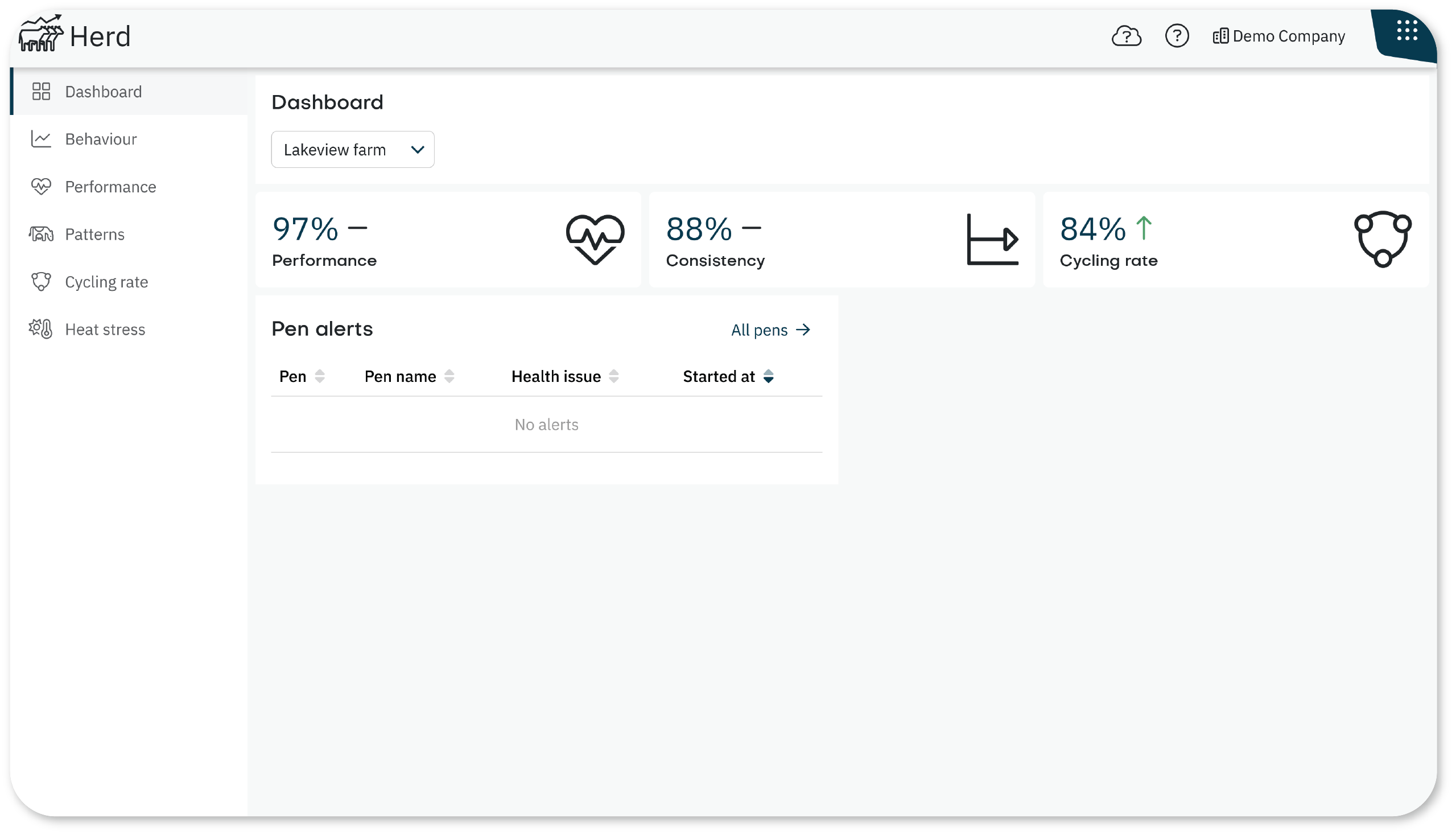
- Understand the Herd Dashboard
- Monitor Daily Behavior of The Herd
- Identify Group-Level Changes in Herd Performance
- Use the Patterns Tab to Detect Shifts in Herd Behavior
- Monitor Fertility After Calving
- View Heat Stress Levels in Your Herd
- Analyze Group Behavior Trends with the Behavior Graph
- Add Context to Performance Trends with Notes
- Edit or Delete a Note
- View Pen Analytics to Find Pen Mismatches
- Nedap Now - Reports
-
Nedap Now - Tag
- Understand the Tag app
- Add SmartTags to the System
- Overview of All Tags
- View Tag Usage and Billing by Month
- Link SmartTags to Animals
- Manually Link SmartTags to Animals
- Link SmartTags to Animals Using NFC
- Link SmartTags to Animals Using QR Codes
- Delete a SmartTag from the System
- Manage Tag Notifications Settings
- Nedap Now - Sorting
- Nedap Now - Settings
- Nedap Now - Data Connector
- Nedap Now - Mobile app